Brand Colors
Our core brand colors of crimson and white are rich with history and tradition, and our secondary colors add energy and a modern touch to communications.
Core Palette
Consistent use of these colors helps strengthen the NMSU brand, and we strongly recommend featuring them prominently in print and digital media communications.
| Color Name | Web | Swatch | |
|---|---|---|---|
| Aggie Crimson |
RGB: 140/11/66 |
CMYK: 10/97/37/43* PMS: 208 |
|
| White Sands | RGB: 255/255/255 HEX: #FFFFFF |
CMYK: 0/0/0/0 PMS: N/A |
*Work with your printer to ensure you’re using the correct CMYK breakdown for Aggie Crimson.
Expanded Palette
NMSU's expanded palette is a broad set of secondary and tertiary colors that provides flexibility and supports a range of creative executions while also reinforcing the NMSU brand. These colors should be used in addition to the core palette. For usage guidelines see Brand Color Hierarchy.
| Color Name | Web | Swatch | |
|---|---|---|---|
| Azure Sky | RGB: 0/157/184 HEX: #009DB8 |
CMYK: 100/0/22/10 PMS: 2229 C |
|
| Desert Monsoon | RGB: 109/110/113 HEX: #6D6E71 |
CMYK: 0/0/0/70 PMS: Cool Grey 10 |
|
| Sagebrush Mint | RGB: 108/195/188 HEX: #6CC3BC |
CMYK: 56/2/30/0 PMS: 7472 C |
|
| Mesilla Valley Sunset | RGB: 242/130/79 HEX: #F2824F |
CMYK: 1/60/75/0 PMS: 1575 C |
|
| Organ Mountain | RGB: 182/165/173 HEX: #B6A5AD |
CMYK: 25/30/20/5 PMS: 5225 C |
|
| Desert Sand | RGB: 215/201/196 HEX: #D7C9C4 |
CMYK: 10/15/15/5 PMS: 7604 C |
Using the Color Palette

Primary Colors: Aggie Crimson and White Sands
Primary Colors
Aggie Crimson is our main identifier, and it should always be present and the dominant color in your designs. White Sands and black font colors help with legibility when used over Aggie Crimson backgrounds. When used as a background color, White Sands is a great option when you want to highlight Aggie Crimson in your design.
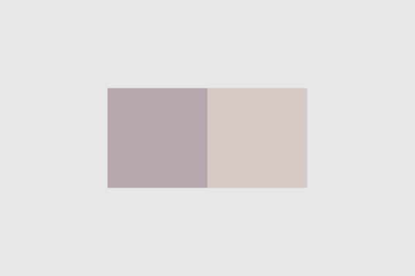
Secondary Colors: Organ Mountain and Desert Sand
Secondary Colors
Organ Mountain and Desert Sand work well as background colors for info boxes and tables. The colors represent our desert landscape, and they give a strong contrast when presenting information or when wanting to draw attention to a particular piece of information.

Tertiary Colors: Azure Sky, Mesilla Valley Sunset, Desert Monsoon and Sagebrush Mint
Tertiary Colors
A small pop of color can go a long way! Azure Sky and Mesilla Valley Sunset add the right amount of pop when used for subheadings, drop caps or smaller info graphics. Azure Sky works great for highlighting URLs in text, and Desert Monsoon is an option for elements that need a dark highlight. Sagebrush Mint can be used for other minor design elements such as arrows and shapes. For accessibility reasons, Sagebrush Mint should not be used as a font color. Overall, these tertiary colors should be used sparingly and should not take up more than 20 percent of the overall color palette in your design.
PMS for spot-color printing
CMYK for process-color printing
RGB or HEX code for screens
Learn more about the printing production process and how to work with color values for your communication projects.
Aggie Crimson, along with white, should always be the most prominent color used. The core color palette is used generously on official communications such as business cards, letterhead and presentations, as well as on a broad range of marketing materials and on the Web. Including Aggie Crimson in your communications helps to reinforce the relationship between your department and NMSU as a whole.
The core and extended palettes can be combined in several ways that can change the tone in your design. However, combining colors with Aggie Crimson requires careful consideration.
For example, Aggie Crimson, Desert Monsoon, and White Sands feel traditionally “NMSU.” Using Aggie Crimson in combination with White Sands and Azure Sky feels contemporary while still reflecting elements of NMSU’s history and legacy.

Aggie Crimson, White Sands, Desert Monsoon

Aggie Crimson, White Sands, Azure Sky
It is recommended that you use the extended palette sparingly to provide accents or highlights in the design. When choosing colors from the color palettes, consider the overall tone and mood you are seeking to convey, as well as your specific communications goals.
Color accessibility is important because it helps ensure that everyone can perceive and distinguish information presented in various color combinations, including people with visual impairments or color vision deficiencies.
Color Contrast
Color contrast can be defined as the difference in brightness or vibrancy of two colors when placed next to one another. For example, black text on a white background has high contrast. On the other hand, yellow text on a white background has low contrast. Color contrast is important because it affects legibility and readability of text as well as other content elements that depend on color for comprehension.
Contrast is typically measured using what’s known as the contrast ratio, a numerical value that represents the relative difference in luminance (brightness) between two colors. The contrast ratio is calculated by comparing the luminance of the foreground color (such as text) to that of the background color (such as the background of a webpage).
Contrast Requirements
The Web Content Accessibility Guidelines (WCAG) provide specific criteria for contrast ratios to ensure that text is easily readable for a wide range of users. The current WCAG 2.2 standard recommends a minimum contrast ratio of 4.5:1 for normal text and 3:1 for large text (typically 18 pt or 14 pt bold). You can use the same contrast guidelines in any design project, whether it is for digital or print.
By ensuring sufficient contrast between foreground and background colors, we make it easier for all users to perceive and understand the information being presented.

Sufficient Contrast

Insufficient Contrast
Best Practices
While color is a powerful element for effective communications, it must always be used as a secondary indicator of meaning. To accommodate visually impaired users, use additional visual clues such as an underline or bold text. Consider incorporating secondary design elements such as textures and patterns that complement your primary color scheme. These additional elements provide an extra layer of information for those who may not perceive all colors equally. The most important thing to remember: If your design doesn’t work in black and white, your design doesn’t work.
Accessibility resources
NMSU’s Web Communications department can offer guidance on accessible web design.
The WebAIM Contrast Checker and Adobe Color Checker are free tools for checking color contrast.
Review the NMSU Brand Color Contrast Chart for details on which core and extended palette combinations are most accessible.
Got a brand question?
We'd love to talk about how we can help you.